Covid-19 Infographic
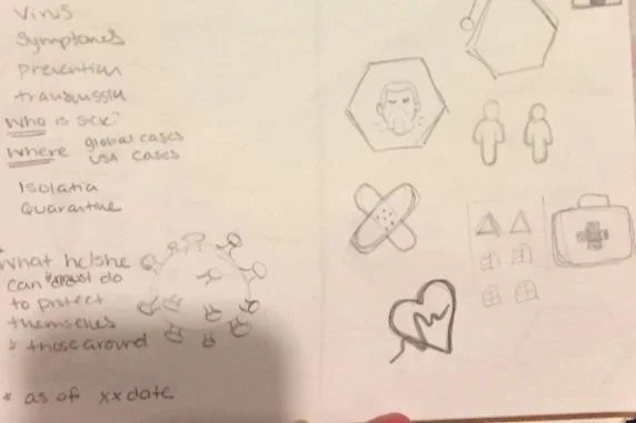
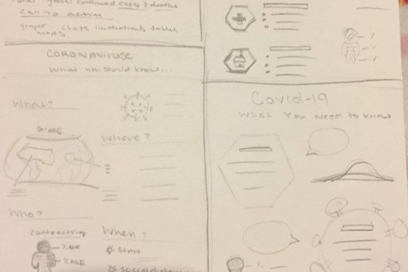
Summary: The class brief tasked me with creating an infographic to help the community better understand Covid-19. At this time (Early April, 2020) I did not understand covid-19, so my process started with research. I wanted to gather information about “what” Covid-19 is, “how” Covid-19 works or spreads, and “who” Covid-19 is most likely to infect. After I had answered all my questions, I started sketching different icons that could help people better understand the information I would be sharing.
Initial Versions
My research lead to various questions that I wanted to include in my infographic. The icons I created were based on the questions I was focused on answering. The icons help to break up the sections even further and add a sense of ease to a very stressful time. The two colors associated with Charlotte health care are teal and purple. They are the primary colors of the two largest health care networks in the area. I used these two colors to be representative of our medical community and be relative to the city writ large.
Covid-19 Virus Illustration
Heart Rate
Flatten the Curve
Please Cover Your Mouth!
Final Covid-19 Infographic
Programs: Adobe Illustrator


